Preview your project’s pages and components in VS Code.
A VS Code extension that renders HTML pages, TypeScript component previews, Storybook stories, and running apps on one canvas at device widths. You can annotate a page and copy the annotations, with a screenshot, as a prompt for a coding agent.
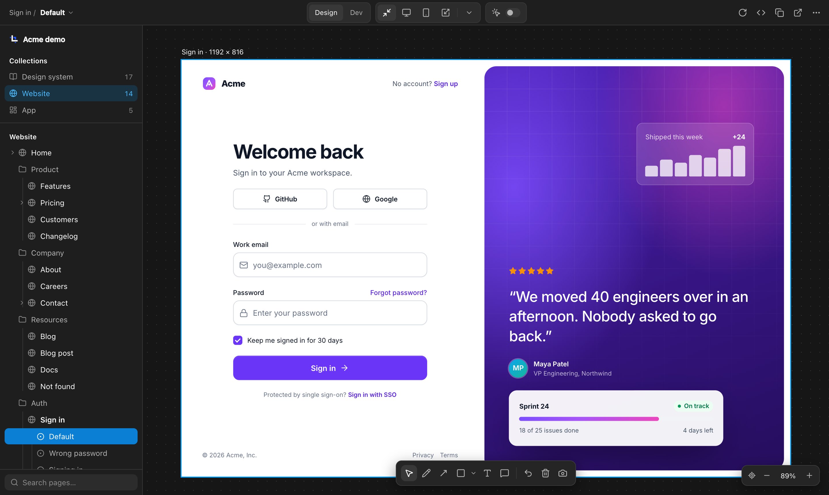
Layout
Workbench reads workbench.yaml at the root of your project. The sidebar lists the pages it declares, the TypeScript previews it finds, and the devices of an iOS Simulator catalog you enable. Matching collection and group names bring those pages together in one list. Its bundled native compiler caches unchanged preview builds across restarts.
- 01
Page list
The collections in
workbench.yaml, such as Pages and Components, at the top; the selected collection’s groups and pages below; search at the bottom. A page’s scenarios are listed under it. In VS Code the list is in the sidebar, under a switcher for the spaces you’ve added. - 02
Top bar
The page and its scenario on the left. The lens switcher, the size switcher, and the Actions switch in the middle; the page’s actions on the right. Controls that don’t fit move into the More menu.
- 03
Canvas
A page can contain up to 32 declared artboards, each at its own size. Click a label or inactive artboard to select it; the existing controls apply to it. A WebGPU surface shows images of the artboards, rendered in the background once per build, with labels and selection; artboards large enough to read show a static copy of the page with sharp text, and the selected preview runs above it. A single artboard stays live. Scenarios remain alternatives selected with the scenario switcher. Zoom and pan keep each page’s layout width.
- 04
Toolbar
Annotation tools and the handoff, under the artboard. Select returns to using the page.
Controls
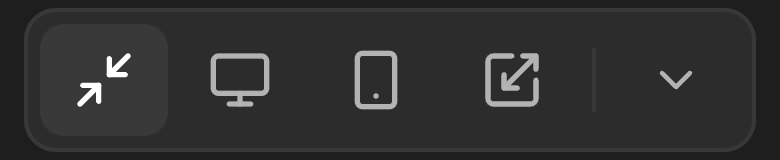
The size switcher, the Actions switch, and the page’s actions are in the top bar. The toolbar’s annotation tools and the view controls are at the bottom of the canvas. Point at or tap a control to see what it does.

All controls
Interaction
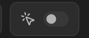
- Actions
- Off by default: links and form submissions are logged instead of followed. Turn it on to let links navigate and forms submit.
Only in some setups
- Space switcher
- At the top of the VS Code sidebar, and in the canvas breadcrumb when several spaces are available. Pick a space with the pointer or arrow keys to open its first page; Escape closes the menu and Tab moves to the next control.
- Scenario switcher
- Beside the page’s name in the top bar when it has scenarios, or under a Storybook lens, listing the title’s stories. Story picks reuse the loaded preview, with one loading status until the requested story is ready. Page and story names stay consistent across the breadcrumb, tab, and artboard label.
- Lens switcher
- The page’s docs, then the authored page, then additional implementations declared in
workbench.yaml. A page with docs opens on them. Every lens label is customizable; defaults are Preview for TypeScript previews and Design for HTML pages. See Lenses. - Preview controls
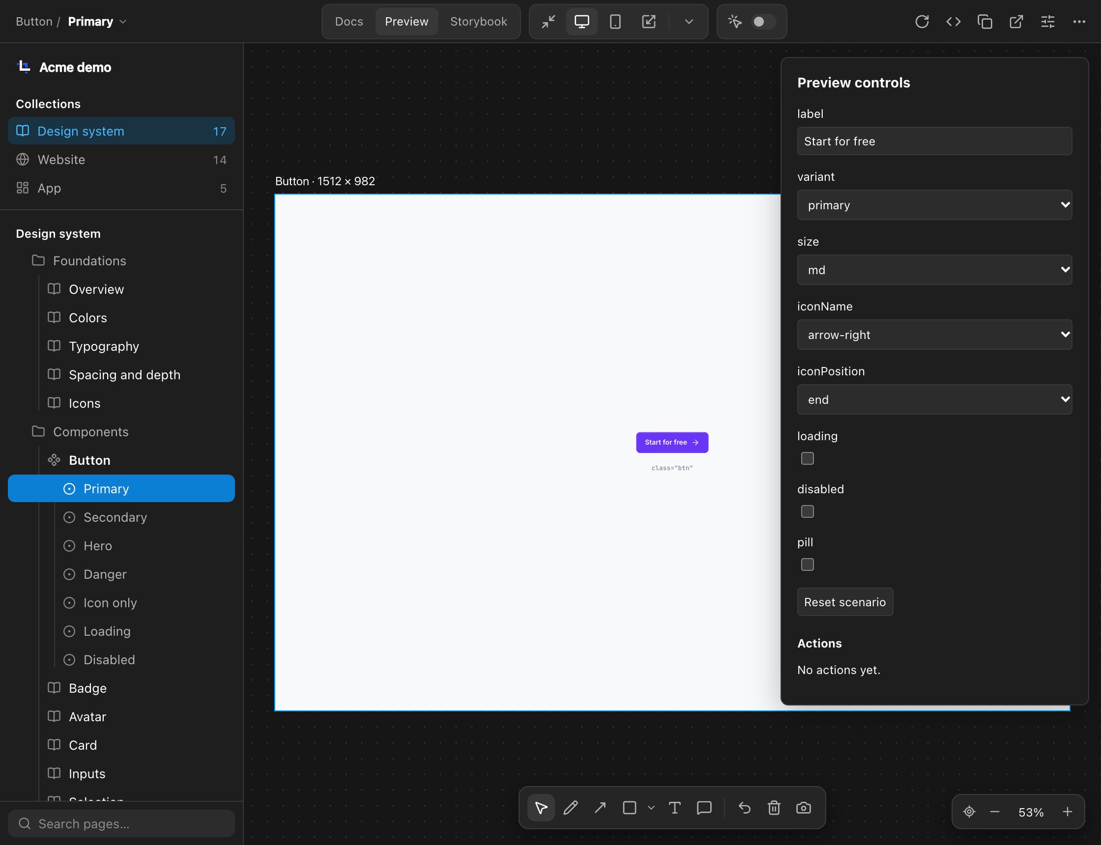
- For Workbench previews: edit inputs, reset the selected scenario, inspect actions, and read documentation. Changes stay temporary.
- Artboard sessions
- In a declared group, select an artboard to interact. Leaving a ready artboard keeps an image of its current state when capture is available; at the captured artboard size, the image stays visible at every zoom and is marked Stale after a build. Resizing uses a background render at the new size until a matching capture is available. Up to eight artboards you click or type in keep application state; using a ninth releases the one used longest ago. If that release fails, the existing eight stay pinned and the new app stays warm without a pin. Release in the selected label keeps an image of what you did and ends the document. Restart creates a fresh document and resets application state.
- Copy handoff
- In VS Code only, at the end of the toolbar, beside a count of your annotations. See Annotations and handoff.
View controls
- Recenter view
- Brings the artboard back to the middle of the canvas at the current zoom level.
- Zoom out
- Halves the zoom, to the next power of two. ⌘− or Ctrl −.
- Zoom level
- Opens zoom to fit, zoom to 100%, 50%, and 200%.
- Zoom in
- Doubles the zoom, to the next power of two. ⌘+ or Ctrl +.
As in Figma: ⌘ or Ctrl with the scroll wheel, or a pinch, zooms at the pointer. Scroll to pan, or hold Space and drag. ⌘0 or ⇧0 zooms to 100%; ⇧1 zooms to fit. A new size fits itself to the window until you zoom or pan.
Annotations
- Select
- Use the page, and pick or move annotations. Esc returns here from any drawing tool.
- Scribble
- Freehand drawing.
- Arrow
- An arrow.
- Shapes
- Rectangle by default. The small arrow beside it switches to a line or a circle.
- Text
- A label placed on the page.
- Comment
- A pinned note.
- Undo
- Removes the last annotation. ⌘Z or Ctrl Z.
- Clear annotations
- Removes every annotation on the page.
- Save screenshot
- Downloads a JPEG of the page with your annotations on it.
Size
- Fit
- The artboard fills whatever space the workbench has.
- Laptop
- 1512 × 982, a 14-inch MacBook Pro. The canvas zooms out to show all of it; the page still lays out at its full width.
- Mobile
- 393 × 852, an iPhone 15 Pro.
- Resizable
- Drag an outside edge or corner to any size. The artboard keeps that size until you change it.
- More sizes
- Every size the space has, with Custom size… to add one and Edit sizes… to change them. A docs lens fills the canvas, so every size is off there.
Page
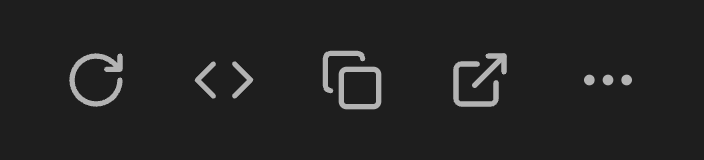
- Reload
- Reloads the page.
- Open the source
- Lists the page’s design file and any implementation code, and opens one in the editor.
- Copy reference
- Copies a short text reference to the page, scenario, and lens, for pasting into a conversation. It doesn’t include a screenshot or your annotations.
- Open on its own
- Opens the page directly in a browser tab.
- More (⋯)
- Configure pages: a form for adding and removing collections, groups and pages, editing labels and paths, and choosing each page’s sizes; it rewrites only the
collectionspart ofworkbench.yaml. Export…: choose a page, selected pages, a collection, or the space, then download sources, a PDF, images, or a portable viewer. ZIP parts stay at 10 MB or less. When the window is narrow, the controls that don’t fit move here too.
Several views of a page
A page can have several scenarios, such as a sign-in form when empty and after a wrong password. Scenarios are listed under their page, like stories under a component in Storybook.
An HTML page reads its scenario from html[data-wb-scenario]. Match CSS on html[data-wb-scenario="error"], keep an element only in some scenarios with data-wb-scenario-only="error", or set a value with data-wb-set-error="value=…". No scripts are added to your pages.
- label: Sign in
  src: pages/sign-in.html
  scenarios:
    - id: default
      label: Default
    - id: error
      label: Wrong password
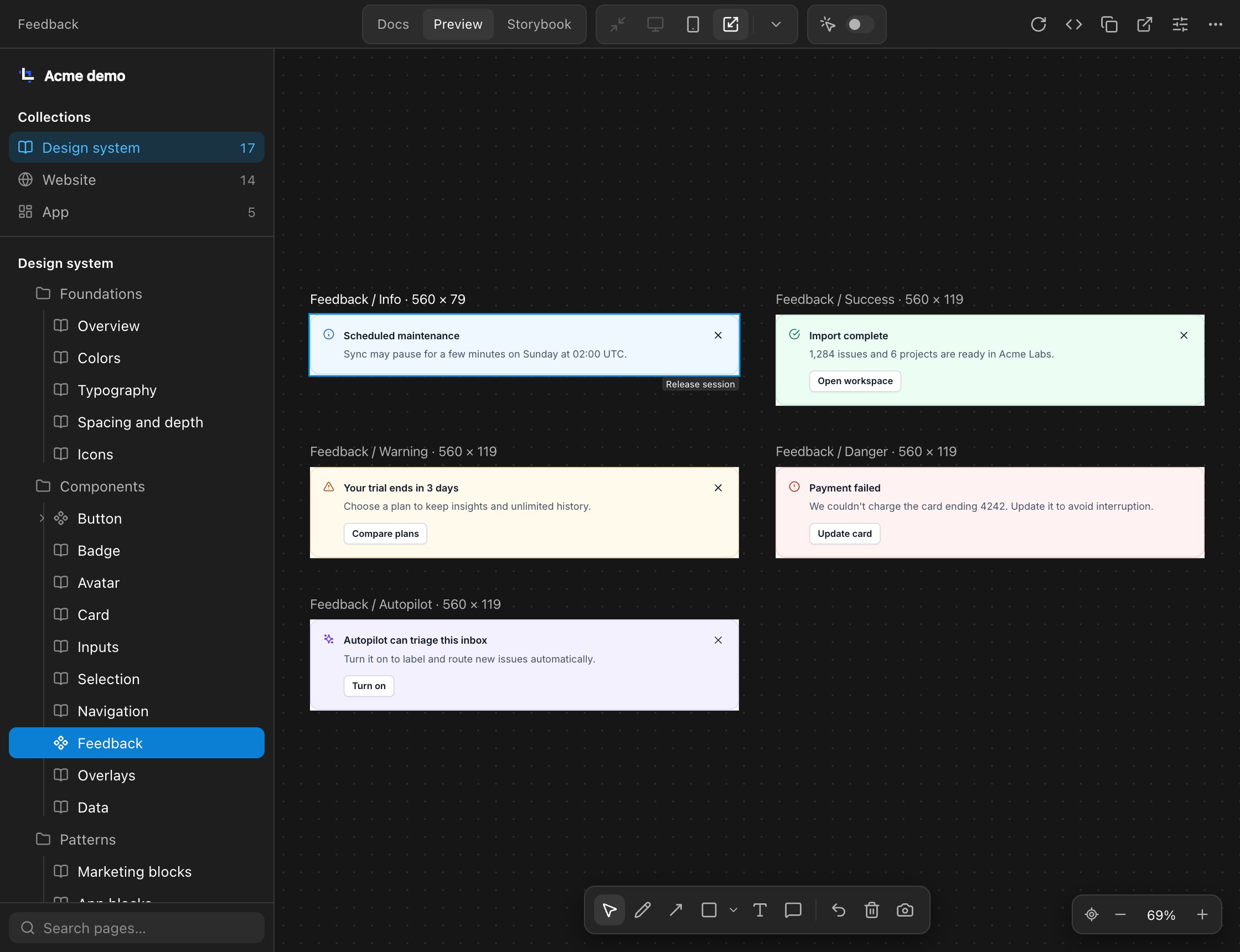
A preview page can also declare several artboards shown together. The Feedback page, pictured here, contains Info, Success, Warning, Danger, and Autopilot artboards. These are children of one page; its variants are not scenarios in the sidebar. Each preview fills its artboard; the grid belongs to the surrounding canvas. Screenshots include the entire group at full resolution, using current retained images or loading never-started members in bounded slots. A stale or missing image for a released session requires an explicit restart.
Annotate a page and copy it for an agent
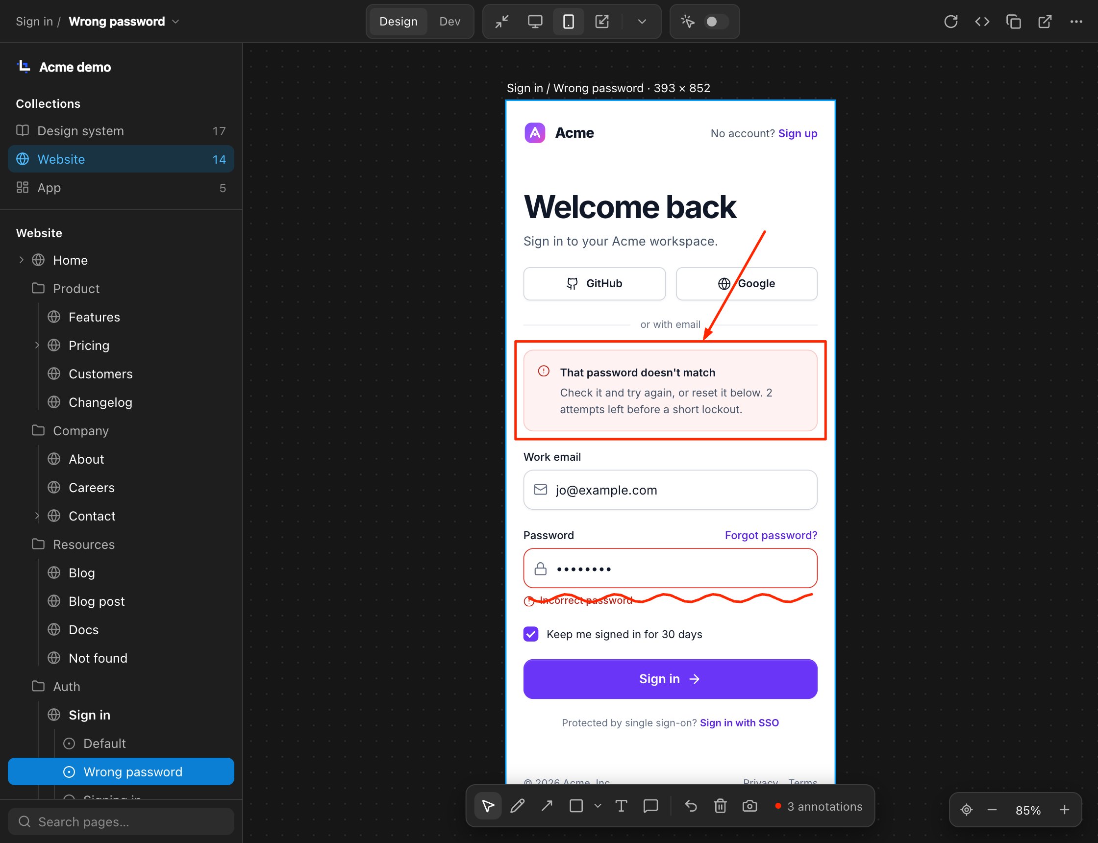
Boxes, arrows, scribbles, and pinned comments are drawn over the running page, which stays usable with Select. Select an annotation to move it, nudge it with the arrow keys, or delete it with Delete.
In VS Code, Copy handoff saves a screenshot to the project’s ignored .canonic/.handoffs/ folder, clears the annotations, and copies a text description of each annotation to the clipboard: the element under it and the page’s source file. Paste it into a coding agent’s chat.
TypeScript previews and lenses
Define components and pages in .workbench.ts files. Built-in adapters render HTML, React, Vue, Astro, and React Native Web, and you can register others. React Native Web screens with a root view using flex: 1 fill the frame without extra CSS. Each preview has named scenarios, editable inputs, and an action log. A page can also show its implementation as a lens: a Storybook story, a dev or staging URL, the iOS Simulator, or a macOS app window.
Each scenario gives the preview its data: props, providers from a project-wide environment, or mocked responses to the page’s fetch and XMLHttpRequest calls. Links can open other previews; other navigation, such as a download or a route without a preview, is logged as an action. See Give a page its data.
The selected lens stays as you change pages and is part of the address, so a copied link opens the same view. You can choose sidebar icons for TypeScript previews individually or by title prefix, and give a shared collection its own icon. SVG icon sprites in TypeScript previews remain available as you switch scenarios or return to a page. For a Storybook or local server, you can configure a start command and a readiness check; in a trusted workspace, Workbench runs the command in a terminal when the check fails. The canvas opens while the service starts, and the page list refreshes when readiness checks finish. For users with existing access to the private, unpublished Gate CLI, an optional integration lets a URL lens follow a task’s allocated service port, keeping concurrent task demos separate. Gate has no public distribution channel. The design-system export includes a static viewer for the previews; Astro previews export their authored scenarios only. If the viewer cannot be built, the export still delivers sources and reference screenshots with a warning.
#pages/sign-in.html:error@393~stagingpages/sign-in.html | the page’s design file |
:error | the scenario, left out for the default |
@393 | the size: a device width, fit, or a resizable size |
~staging | the lens, left out for the page’s default lens |
Component documentation with live examples
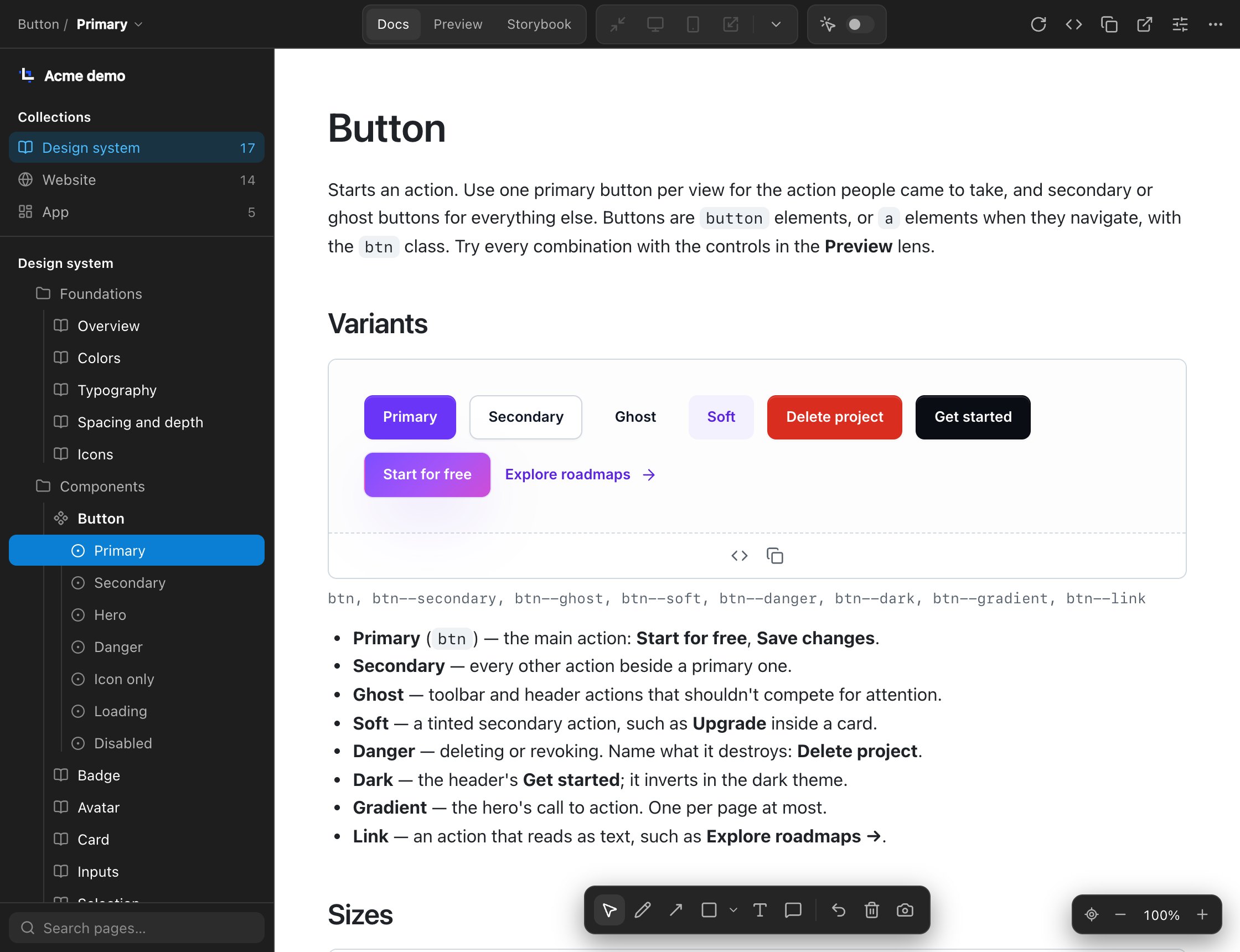
A page written in Markdown documents a component or a part of a design system: sections, notes, hand-written props tables, and live examples rendered from your own source files. Show code under an example shows its source. Docs are a lens: any page can have them, listed first before its design and implementations, and the page opens on them. In a docs lens they fill the canvas, on white, without an artboard label or selection border, and scroll like a web page.
Docs lenses render the same examples in different ways, such as React and React Native Web. Code text appears first and gains colour in the background, using Workbench’s bundled highlighter. Annotations, handoffs, and export work in docs lenses too. Export a page, selected pages, a collection, or the whole space as a source ZIP, PDF, image ZIP, or portable browser viewer. PDFs preserve visual page dimensions and paginate documentation on A4 or Letter paper. See Docs.
# Card

A plain bordered surface that groups related content.

## Basic

```example basic
caption: children
```

The surface alone.Configuration
Workbench activates in a folder with a workbench.yaml at its root. Your pages and preview definitions stay in your project; the extension adds nothing to them.
name: Acme

collections:
  - name: Pages
    icon: file-text
    items:
      - label: Sign in
        src: pages/sign-in.html
Install
In VS Code, search for Canonic Workbench in the Extensions view, or see it on the Visual Studio Marketplace ↗. For Cursor, Windsurf, and other VS Code forks, install the .vsix for your platform:
- 01Install a .vsix
Only needed outside the Marketplace. In the Extensions view, click ⋯ and choose Install from VSIX…, or run:
code --install-extension <file>.vsix - 02Reload the window
If the editor was already open, run Developer: Reload Window from the Command Palette.
- 03Add workbench.yaml
Create it at the root of your project, like the example above.
- 04Open the canvas
Open the Workbench view in the activity bar and pick a page.